Have you ever wondered why most finance companies use blue, and almost every fast-food brand uses red and yellow?
It’s not a coincidence—this is visual psychology at work!
Your brain is naturally wired to understand branding. Big companies simply speak the visual language your mind already recognizes.
How do designers talk directly to your subconscious?
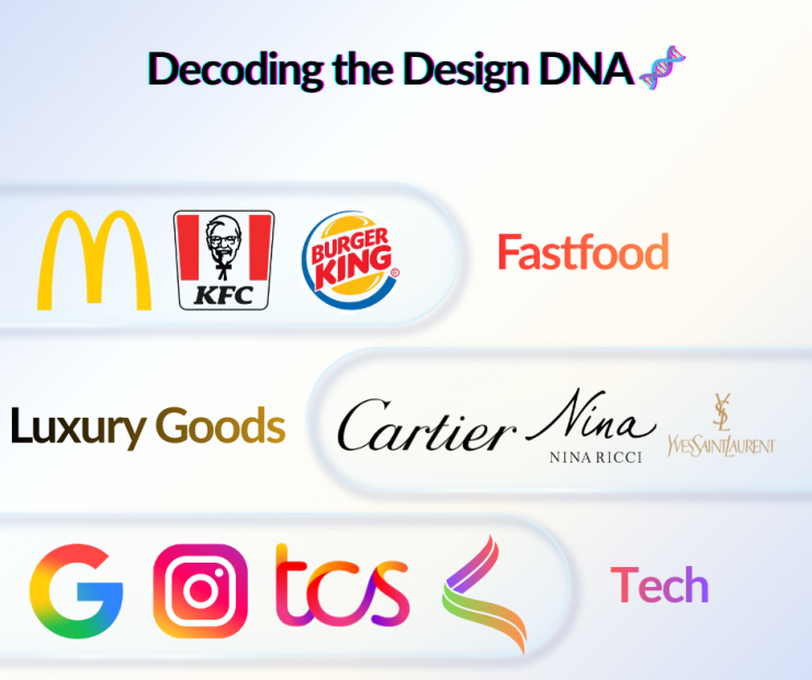
Red + Yellow + Bold Shapes
This combo creates a sense of urgency and hunger. It’s highly visible, grabs attention instantly, and feels like it’s saying, “Eat this now!”
Gradient (Smooth Color Transitions)
Tech companies use gradients a lot today because they represent innovation, movement, modernity, and a futuristic vibe.
Thin Black Lines + Minimal Text
This style communicates elegance, exclusivity, and a timeless feel.
It doesn’t shout; it quietly shows class.